NHS in numbers: total spending
There are lots of questions about health spending in the NHS. Do we spend the right amount on mental health compared with acute services? What about primary care and community services? Do we get the balance right between treatment and prevention? And even within acute services, for example, should we be spending more or less on cancer compared with, say, cardiac services?
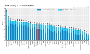
But there’s a fundamental question. Are we spending the right amount of money on health in general? There is perhaps no objective right answer, so most people look at one key metric – how our spending compares with other European countries and health services across the globe.
The specific metric used is spending as a proportion of gross domestic product. And there are two things to understand before looking at the relative spending levels. First, are we comparing like with like? Is one country’s definition of health spending, the same as another’s and can this be identified from the national accounts? Second, gross domestic products can go up or down. So, if the total value of all a country’s goods made and services provided in a year go down, health spending as a proportion of GDP will increase – but no extra money has been spent on health.
According to the latest figures on the OECD website, in 2016 the UK spent 9.7% on health compared with an average across the 35 other OECD countries of 9%. While this puts it slightly behind the major European countries of Germany (11.3%) and France (11%) – and a long way behind the US (17.2%) – it is at the higher end of the pack.
Health spending as a proportion of GDP was famously highlighted in 2000 when then Labour prime minister Tony Blair pledged to bring the UK spend (6.3% at the time) in line with the average across the 14 other EU countries (8.5%) through increases in spending. Spending did rise significantly, taking UK spending to 8.8% by 2009, although this remained behind the EU14 average which had itself risen to 10.1%.
When comparing different countries, you also need to keep in mind that spending from all sources is included: government, out-of-pocket, insurance and charity-funded. Look out for Treasury references to UK public health spending, which, unlike the OECD figure, includes capital spending.
Comparing now with then is also difficult. Changes in OECD definitions in 2013 brought additional spending into scope. It wasn’t new money – it was just newly counted. So, while UK health spending was falling as a proportion of GDP immediately prior to this, it leaped to around 9.9% as a result of the changes.
Spending only provides a partial view of whether a country is putting the right resources into health. You also need to look at outcomes. Low relative spending but better outcomes would not necessarily make a case for increased spending.
The Commonwealth Fund’s regular Mirror, mirror comparison of 11 countries healthcare systems ranks the US last in access, equity, healthcare outcomes and next to last in administrative efficiency. The UK comes top in all areas other than outcomes, where it was ranked 10th in the 2017 report.
• Relative spending metrics were discussed in Health + wealth, Healthcare Finance, June 2017 and is extensively covered in the HFMA’s level 7 advanced certificate qualification (in the core Making finance work in the NHS and Comparative healthcare systems modules)
Related content
The Institute’s annual costing conference provides the NHS with the latest developments and guidance in NHS costing.
The value masterclass shares examples of organisations and systems that have pursued a value-driven approach and the results they have achieved.