Comment / Annual accounts shouldn’t be boring
I’ve been a professional consumer of NHS accounts and annual reports for more years than has probably been good for me. If there’s one thing that often strikes me, it’s how terribly, terribly boring most of them are.
Apart from the numbers (which are of course intensely interesting), the presentation can be dull. Tables (and more tables), some axis-label missing line graphs, the odd 3D pie chart and, if you’re lucky, a few full-page stock photos of a smiley nurse doing something or other to a beaming older person.
There’s obviously a need to convey the basics of the accounts and to comply with reporting standards. But the accounts and annual report also provide an opportunity to really communicate what those who pay for and consume NHS care want to know.
If there’s one question I’ve been asked more than any other by those not in the healthcare business (and, actually, by quite a few who are) it’s ‘where does the money come from and where does it go?’
In a narrow technical sense this is exactly what accounts answer. But they do it in a way that seems to conceal more than they reveal and in a style that most people find baffling and impenetrable.
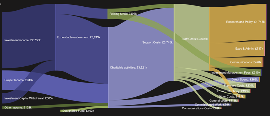
One way of answering the money flow question, and in a more interesting and visually engaging way, is to use a Sankey diagram. I had a go in illustrating the entire flow of health and care spending for the UK using data from the Organisation for Economic Co-operation and Development (OECD). At a more parochial level, if you want to know where the Nuffield Trust gets its money (essentially, the eponymous Oxford-based car magnate) and what it spends it on, this Sankey diagram captures our latest accounts in 2020.

(Click on image to view in full size)
A Sankey and old school pie chart mash-up can also communicate a lot of information about a trust’s outputs too. Here I tried to capture the national flows in outpatient services, from referrals to types of attendances and on to specialties. Stream charts can show flows over time too, and can bring home the gestalt or overall form and shape of trends and patterns in numbers. My colleague Liz Fisher has done just that here to show the explosion in respiratory diseases in the first Covid wave and the appalling toll on care home residents.
I do recognise that one person’s beautifully clear Sankey diagram can be another’s indecipherable tangle of lines. It’s also possible to take the design of annual accounts too far of course. I like the idea of an annual report from a solar energy company, where the apparently blank pages only reveal themselves when exposed to the sun. But it’s hard to see a public organisation justifying the expense of such a publication. The same goes for the Irish service station company Applegreen’s 2013 annual report, illustrated with photographs of hand cut paper models; looks great and is engaging… but, well, hmmm.
Back to the possible (and affordable). Bar charts and line graphs have their place and are often the most understandable way of presenting data, but sometimes it’s possible to be a bit more adventurous.
NHS organisations have great stores of financial and activity data that – with a bit of data viz wizardry – could really improve transparency and accountability with the public, patients (and indeed staff). Maybe the HFMA could run a competition for the best presentation of NHS financial accounts and annual reports…
Related content
The Institute’s annual costing conference provides the NHS with the latest developments and guidance in NHS costing.
The value masterclass shares examples of organisations and systems that have pursued a value-driven approach and the results they have achieved.